If Apple’s mixed reality headset is going to succeed, it’s going to be because of the apps. On Monday, Apple will take the stage at its 2023 Worldwide Developers Conference to talk about FaceTime and Apple Books and all the other cool built-in stuff you’ll be able to do with its ski goggles strapped to your face. But if it can’t get third-party developers on board, and those developers don’t figure out how to build life-changingly great stuff for those goggles, the Reality Pro (or whatever it’s called) doesn’t stand a chance.
Apple knows this better than anyone, of course. The iPhone took off when apps like Instagram and Uber showed what you could do with a camera and a GPS in your pocket. The iPad became a creative tool because creative people kept building cool stuff to do on such a huge touchscreen. And developers at places like Nike and Strava did more to make the case for the Apple Watch than Apple’s Walkie Talkie app and weird heartbeat-sending thing ever did. Apple’s product strategy for 15 years has been to make the coolest gadget it can, show it to developers, and ask them what they think.
To make the headset really work, though, Apple’s going to need more than just apps. Because a good headset is more than just a big screen; it’s a new way of interacting with a gadget and with apps. That means that 15 years after the launch of the App Store, when Apple turned the iPhone into the app machine it is now, it’s going to have to reboot the whole idea of what an app is and how it works. And it won’t be easy.
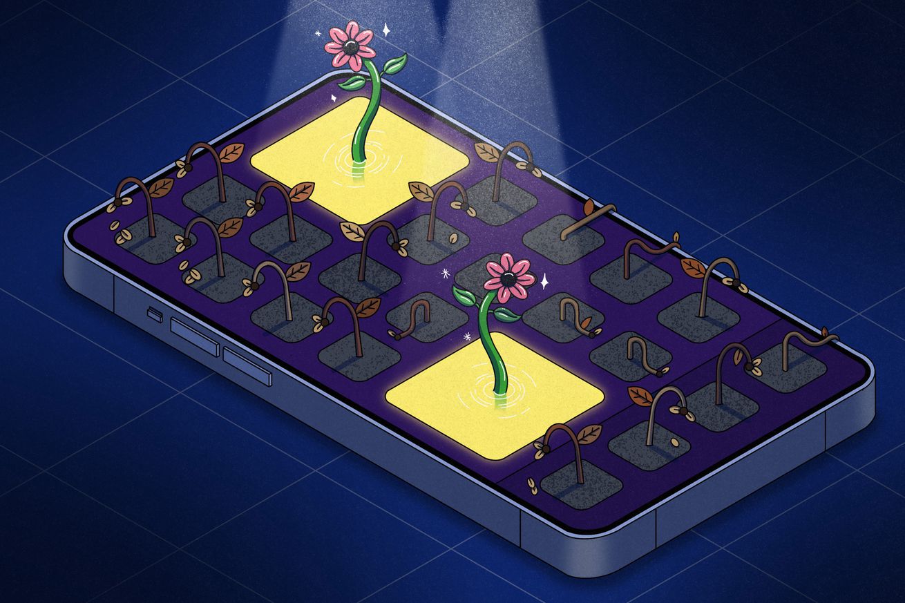
An ocean of icons
By and large, every app is a universe unto itself. The whole structure of the app ecosystem is such that the first step of every process is to open an app. There’s no command line equivalent through which you can execute tasks across the whole system; even things like search work far better in apps than across all of iOS.
Apple has been trying to change this for years. Every year, almost without fail, Apple has a Big New Idea About Apps. At WWDC, in addition to all the changes to Reminders and new locations for URL bars in Safari, Apple nearly always tries to change the way you interact with apps and they interact with each other. Want proof? Here’s an incomplete list of the Big New Ideas About Apps Apple has shown off at WWDC since the iPhone launched:
- 2008 (iPhone OS 2.0): The App Store
- 2009 (iPhone OS 3.0): In-app purchases, push notifications
- 2010 (iOS 4): Multitasking
- 2011 (iOS 5): The notification center
- 2012 (iOS 6): Siri, the share sheet
- 2013 (iOS 7): Lock screen notifications, Spotlight search
- 2014 (iOS 8): Continuity, Handoff, widgets
- 2015 (iOS 9): 3D Touch, Proactive Intelligence
- 2016 (iOS 10): iMessage App Store
- 2018 (iOS 12): Shortcuts
- 2020 (iOS 14): App Clips, homescreen widgets
- 2021 (iOS 15): Focus modes
- 2022 (iOS 16): Lock screen widgets, Live Activities, Dynamic Island
If you squint a little, you can see the larger vision here. Apple imagines an app ecosystem in which data flows freely between devices: you take a picture here, edit it there, share it over there, save it in that place, all with a few drags and drops. It wants to make apps work between and across your devices. You should be able to access your apps and the data inside them from just about anywhere on your device. In Apple’s wildest dreams, apps aren’t each their own universe; they’re like stars in a solar system, each one part of a larger coherent thing.
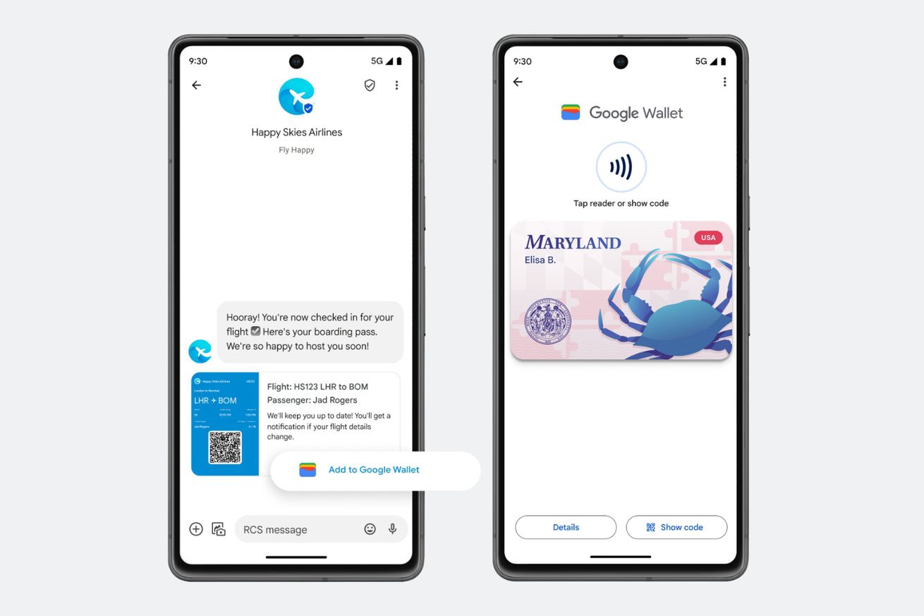
A few of Apple’s own apps are good examples of how this could work. Wallet pulls all your tickets and boarding passes from other apps into one place, no matter where they came from. Home aggregates your many devices across many ecosystems and lets you run your whole smart home in one place. Files provides a file storage system that is theoretically available to any app anywhere. Live Photos and Live Text are system-level features, not apps you have to open just to accomplish a single task.
But when it comes to the rest of the App Store, what have we actually gotten out of all those big ideas? Shortcuts are hugely useful but far too complicated for most users; Siri is mostly just annoying; App Clips and iMessage apps never really took off; I have yet to see an app that makes actual use of the Dynamic Island; 3D Touch is already long gone. In 15 years, for all intents and purposes, apps have only really fundamentally changed in one way: thanks to push notifications and widgets, they can now send you information without needing you to open the app.
/cdn.vox-cdn.com/uploads/chorus_asset/file/24020010/226270_iPHONE_14_PHO_akrales_0070.jpg) Photo by Amelia Holowaty Krales / The Verge
Photo by Amelia Holowaty Krales / The Verge
To some extent, it’s just business. Many developers prefer to keep users inside their app as long as possible to juice ad impressions and increase engagement. And Apple certainly has little incentive to blow up the app model as long as it keeps taking a hefty cut of everyone’s subscription fees. “I think they’ve tried to approach stuff like, ‘Hey, here’s a new platform. We’re not just going to put a grid of apps on it. What’s the next level of that?’” says Ryan Jones, a developer of the popular Flighty app. “And so far the magnetic pull of apps has pulled them back towards a grid of apps.”
Maybe that’s why, when I asked a bunch of developers what they’re looking for at this year’s WWDC, their answers were so straightforward. “Most of my wishlist things are more pragmatic and practical,” said Greg Pierce, who builds apps like Drafts and Tally through his company, Agile Tortoise. He said he tries not to even make a wishlist anymore — better to just wait and see.
Pierce and a few others said they’re most hoping to see improvements in SwiftUI, Apple’s cross-platform development system. “Actually writing cross platform code with it is painful,” Pierce said. “You end up having to branch a lot of logic to work one way on one platform and one on the other, stuff that could be improved.” Marcos Tanaka, who builds apps like Play and MusicHarbor, echoed the sentiment. “It is a fantastic framework that has genuinely improved my experience developing for Apple platforms,” he said. “Still, sometimes I stumble upon some bugs and limitations that get in the way, so SwiftUI improvements are always welcome.”
The iPhone in particular is such a mature platform that it’s almost risky to try new things. There are so many users, with so much history and muscle memory, that developers might be foolish to try and break paradigms. Even the platform itself makes it hard to move forward. “You’re deploying an app that has to be backward-compatible several OS versions,” Pierce said, “so you can’t take advantage of those new features.”
Greater than its parts
So far, the rumors and reporting we’ve heard about WWDC 2023 sound like more iterative improvements, particularly for the iPhone. The Biggest New Idea About Apps might be interactive widgets — what if you could use an app without opening an app? — but in general, it sounds like a year of improvements rather than radical changes.
/cdn.vox-cdn.com/uploads/chorus_asset/file/24306251/226369_Meta_Quest_Pro_AKrales_0102.jpg) Photo by Amelia Holowaty Krales / The Verge
Photo by Amelia Holowaty Krales / The Verge
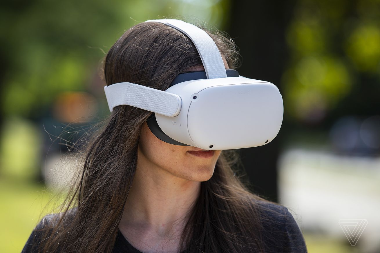
Except a headset demands radical change. Apple has made clear that it doesn’t want to build a full-on metaverse, but it also shouldn’t just turn the platform into a bunch of siloed apps. An all-encompassing device like this just won’t work if you’re constantly switching between apps every time you need new information. Apple has reportedly spent years on supporting hand tracking, facial expression recognition, iris scanning, and other biometric and real-world tools. You’re telling me we’re going to get something called the “Reality Dial,” but I’m still stuck with a dock full of app icons? That just doesn’t feel right.
The interaction model of the future can’t be pinching the air in front of you to mimic tapping on a touchscreen. I’m definitely not interested in having to download, log in, set up, and figure out a new app every time I want to try something new. Apps are going to need to be more modular, showing you just the parts you need as you walk down the street or start a new FaceTime call. They’ll have to be faster and simpler because nobody wants to tweak settings on their face. App developers have spent decades building software for rectangles of various shapes and sizes. But in a world filled with headsets, there are no more rectangles.
Changing the way developers see their apps will be tricky. But with the AI onslaught coming fast and a headset forcing users to use a new device in wholly new ways, this is the moment for Apple to come up with a better, more integrated, more natural way to access and interact with information on their devices. To borrow a Steve Jobs-ism: if you see a homescreen, they blew it.

/cdn.vox-cdn.com/uploads/chorus_asset/file/24699973/image__14_.png) Screenshot by Sean Hollister / The Verge
Screenshot by Sean Hollister / The Verge
/cdn.vox-cdn.com/uploads/chorus_asset/file/24699969/image__15_.png) Screenshot by Sean Hollister / The Verge
Screenshot by Sean Hollister / The Verge
/cdn.vox-cdn.com/uploads/chorus_asset/file/24699972/chrome_c5WT2sXckX.jpg) Screenshot by Sean Hollister / The Verge
Screenshot by Sean Hollister / The Verge/cdn.vox-cdn.com/uploads/chorus_asset/file/24699974/image__13_.png) Screenshot by Sean Hollister / The Verge
Screenshot by Sean Hollister / The Verge

/cdn.vox-cdn.com/uploads/chorus_asset/file/24699456/kfexep6lrykbljcxnb71.jpg) Image: GPD
Image: GPD/cdn.vox-cdn.com/uploads/chorus_asset/file/24699775/slack_imgs.png) Image: GPD
Image: GPD/cdn.vox-cdn.com/uploads/chorus_asset/file/24699784/sttxvtpc5hkp4tvid066.png) Image: GPD
Image: GPD
/cdn.vox-cdn.com/uploads/chorus_asset/file/24699792/Screenshot_2023_06_02_at_5.48.32_PM.jpeg) Image: GPD
Image: GPD
/cdn.vox-cdn.com/uploads/chorus_asset/file/24699900/chrome_trdxbpdQiD.jpg)


/cdn.vox-cdn.com/uploads/chorus_asset/file/24697799/nintendo_valve_email_1_redacted.jpg) Email via Dolphin Team
Email via Dolphin Team
/cdn.vox-cdn.com/uploads/chorus_asset/file/24697798/nintendo_valve_email_2_redacted.jpg) Email via Dolphin Team
Email via Dolphin Team/cdn.vox-cdn.com/uploads/chorus_asset/file/24697797/nintendo_valve_email_3_redacted.jpg) Email via Dolphin Team
Email via Dolphin Team


/cdn.vox-cdn.com/uploads/chorus_asset/file/24696108/04_Exploded_View.jpg) Image: Meta
Image: Meta
/cdn.vox-cdn.com/uploads/chorus_asset/file/24696110/03_Touch_Plus_Controllers_crop.jpg) Image: Meta
Image: Meta

/cdn.vox-cdn.com/uploads/chorus_asset/file/24695883/Add_QR_code_barcode_pass_to_Wallet_via_image.gif) Image: Google
Image: Google
/cdn.vox-cdn.com/uploads/chorus_asset/file/24695906/Add_Boarding_Pass_to_Wallet_via_RCS_10_second_Gif.gif) Image: Google
Image: Google


/cdn.vox-cdn.com/uploads/chorus_asset/file/24692049/EpixPro42_HR_2006.1.jpg) Image: Garmin
Image: Garmin

/cdn.vox-cdn.com/uploads/chorus_asset/file/24693068/rVq2krc.jpeg) Screenshot by Tom Warren / The Verge
Screenshot by Tom Warren / The Verge


/cdn.vox-cdn.com/uploads/chorus_asset/file/24685464/moto_g_stylus_5G_2023_Rose_Champagne_DYN_BACKSIDE_RIGHT.jpg) Image: Motorola
Image: Motorola


