lundi 18 septembre 2023

Sonos Move 2 review: a slam-dunk sequel

Sonos Move 2 review: a slam-dunk sequel

With stereo sound, twice the battery life, and line-in playback, the Move 2 improves upon the original at every turn — unless you need Google Assistant.

When you’re considering the sequel of any tech product, it’s easy to jump to the conclusion that it’s “everything the original should’ve been.” And as I’ve been testing out the new $449 Sonos Move 2 speaker over the last several days, it’s been tempting to lean on that narrative. The Move 2 improves upon the company’s first portable speaker with better, broader sound — it now does stereo instead of just mono audio output — and huge strides in battery life. It’s also more versatile thanks to the inclusion of line in and the ability to reverse charge your phone and other devices via the speaker’s USB-C port. The only downside might be that all of those improvements come with a $50 price hike.

But in truth, the first Move was never going to be anything like this. It came before Sonos figured out how to seamlessly juggle Bluetooth audio with music played over its Wi-Fi-based whole-home audio platform; you had to choose one or the other via a button on the back. (Sonos solved that awkward dilemma with its much more compact Roam speaker.) At the time of the Move’s release, the entry-level Sonos One was also limited to mono playback. It wasn’t until the Era 100 that the company crammed two tweeters into a relatively small single speaker enclosure. Now, it’s running the same play with the Move 2, giving the product dedicated left and right channels instead of blending everything together. But time hasn’t benefited the Move 2 in all ways: amid an ongoing legal rift between Sonos and Google, this smart speaker ships without Google Assistant, which is present on the first-gen hardware.

Save for the tweaked controls on top, the Move 2’s looks haven’t changed much. It’s still the same shape. And it’s still fairly tall (9.53 inches) and weighty (6.61 pounds) to be considered very “portable” — but at least you’ve got the built-in handle for carrying it around. As with the first Move, this is really designed to be moved around different spots inside and outside your home, not so much to accompany you to the beach like a traditional Bluetooth speaker.

A photo of Sonos’ Move 2 portable speaker.
The Move 2 sticks closely to the original’s size and overall design.

Apart from the standard black and white options, Sonos is offering a green color of the Move 2, and I’ve really come to enjoy the olive shade while reviewing it. It’s not overly bold, but it’s stylish and not boring. In the box, you get a wireless charging base station, and unlike the first time around, this one can be detached from its wall plug instead of the whole thing being hardwired. As before, the Move 2 can alternatively be charged through its USB-C port.

Around back is the power button, Bluetooth pairing button, a physical switch for the Move 2’s built-in microphones, and the USB-C port. In keeping with the original, the Move 2 supports automatic Trueplay, which uses the microphones to analyze the speaker’s surroundings and optimize the sound whenever you move it to a new spot. Hands-free voice controls are possible with both Sonos Voice Control and Amazon Alexa. There are two ways to disable the mics: you can tap a speech bubble button on top of the speaker to deactivate voice assistants while keeping features like auto Trueplay enabled. If you want to shut off the microphones altogether, that’s what the rear switch is for.

A photo of Sonos’ Move 2 portable speaker.
But it’s been upgraded with the same touch controls as Sonos’ Era speakers.

But Google Assistant remains absent after first being dropped from the Era lineup. With JBL now offering a speaker that concurrently runs Alexa and Assistant, I’m really hoping that Sonos and Google can put their legal quarrels aside and figure out a way to bring Assistant back into the fold. For a certain set of customers, its absence makes the Move 2 a nonstarter.

Another aspect of the Move 2 that disappoints me (albeit to a lesser degree) is that it can’t serve as a speakerphone for calls. If the thing works with Bluetooth and has mics that I’m already speaking to on a semi-regular basis, why not go the rest of the way, Sonos? Many lower-priced Bluetooth speakers and even Apple’s Bluetooth-less HomePods include this feature, so it’s frustrating to see Sonos omit it yet again.

A photo of the Sonos Move 2 portable speaker.
It’s available in a new olive green color alongside black and white.

But there are several ways in which the company has favorably expanded the Move 2’s capabilities. Like the Eras, it supports line-in (if you purchase Sonos’ $19 USB-C adapter) so you can plug any audio source, such as a turntable, into the speaker and play that content across the rest of your Sonos system. Anything you’re listening to over Bluetooth can also be synchronized across your grouped speakers, which is a convenience that the first-generation Move lacked. Sonos continues to support Apple’s AirPlay 2, and you can directly control its speakers with music services including Spotify, Pandora, Tidal, and many more.

A photo of Sonos’ Move 2 portable speaker.
The Move 2 can stream Bluetooth audio to the rest of your Sonos system.

Another new trick is that the rear USB-C port can be used for charging external devices. It supplies 7.5 watts of power, which isn’t particularly fast, but it’s a good fallback if your phone battery is running low when you’re playing tunes at the park or beach far removed from any outlet.

Battery life on the Move 2 has more than doubled, with Sonos saying it can reach up to 24 hours of continuous playback. That big jump can be attributed to two things: there’s a larger 44Wh battery inside, and the company also made power-saving optimizations under the hood. The bigger battery is backward-compatible with the original Move, but dropping it into that speaker won’t magically get you 24 hours of listening time since the first-gen Move lacks some of the newer efficiency tweaks.

“Placing a Move 2 battery in an original Move will increase the Move’s battery life by about 25 percent, yielding around 13.5 hours of battery life,” Sonos spokesperson Olivia Singer told me by email. “Move 2 has a much more efficient system which contributes to the additional playback improvements.” Either way, I very much appreciate that the battery is easily replaceable to begin with; this ensures a long lifespan for the Move 2 compared to many consumer speakers where the battery will gradually hold less of a charge over time.

A photo of the Sonos Move 2 portable speaker.
Its two tweeters produce stereo audio, unlike the mono first-gen model.

I’ve said more than a few times that the original Move became my favorite overall Sonos product because of its portability and potent sound. The Move 2’s upgrade to stereo isn’t a monumental change — a single-unit speaker is limited in how much separation it can produce — but you can clearly hear the difference. When playing a test file, I could easily distinguish the left and right tweeters within the Move 2. The main benefit of this stereo arrangement is that you won’t need to worry about details of a song being lost in the background as can happen when everything is downmixed to mono.

The overall sound signature is faithful to the original Move, meaning the Move 2 still has a tendency to underemphasize treble; I’m also currently testing the new similarly shaped Ultimate Ears Epicboom, and the UE speaker puts a bigger focus on those crisp upper frequencies while Sonos takes a more even-handed approach. If you want more high end, that’s easy to accomplish using EQ sliders in the Sonos app. Bass response was more than adequate for my needs, but I can see some people wanting more oomph from the Move 2 when really cranking the volume.

A photo of Sonos’ Move 2 portable speaker.
The Move 2 is rated IP54 against dust and water.

Among Sonos’ other speakers, I’d rank the Move 2 below the flagship Sonos Five and the Atmos-oriented Era 300. You’re basically getting a wireless Era 100 that can be taken anywhere, and that’s an enticing thought. Like any of the company’s speakers, you can stereo-pair two Move 2s if you want that wider, more immersive presentation that a single unit can’t quite pull off by itself. But as this is a device meant to be moved around, a stereo pair might not be as practical here as with Sonos’ other speakers.

On that point, the Move 2 is in no way as “portable” or easy to pack with luggage as a Roam, but it’s no trouble to carry around the house, bring out to the backyard, or throw into the trunk when traveling. If you plan to take it on the road constantly, Sonos sells an extremely overpriced $79 carrying case. The original Move came with a fabric carrying bag, but that’s gone this time, and Sonos told me it was only ever intended to keep the speaker protected during transit and shipping.

A photo of the Sonos Move 2 portable speaker.
Battery life can reach up to 24 hours on a single charge.

If you already own the original speaker, you’re no doubt wondering whether this one is worth an upgrade. In most cases, assuming you’re satisfied with what the Move has offered to this point, I’d say the answer is no. The original remains an excellent product — especially if you bought it on sale. But if you constantly find yourself exhausting the Move’s battery or already have a use in mind for the Move 2’s line-in feature, then stepping up to the new one starts to make more sense. The stereo sound will be more enjoyable and truer to your favorite music, but that alone isn’t enough to fork over $450.

As a complete package, the Move 2 is a slam-dunk sequel that will only get better when you factor in Sonos’ long-term software support. The company needed to draw on lessons learned from other products to get here, but anyone who loved the first Move will find even greater value in its successor. Hopefully Google Assistant will eventually make a comeback. But even if not, the Move 2 offers plenty of features and good enough sound to make it a unique standout in Sonos’ hardware lineup.

Photography by Chris Welch / The Verge

Amazon’s fall Prime Day sale is happening October 10th and 11th

Amazon’s fall Prime Day sale is happening October 10th and 11th
Illustration showing Amazon’s logo on a black, orange, and tan background, formed by outlines of the letter “A.”
It’s another sale to convince you to subscribe (or stay subscribed) to Prime. | Illustration by Alex Castro / The Verge

We knew it was coming, but now we can officially mark our calendars for the next Prime Day sale. Amazon has announced that its fall Prime Day is scheduled for October 10th and 11th. Last year’s fall sales event from around the same time was called the Prime Early Access Sale, and this time around, Amazon is calling it Prime Big Deal Days.

Setting aside the confusing fact that Amazon can’t settle on consistent naming, Prime Big Deal Days is designed to kick off the early holiday shopping season well ahead of Black Friday / Cyber Monday, and frankly, it sounds a whole lot like last year’s event.

Amazon says there will be big discounts and seasonal deals from brands like Sony, iRobot, Dyson, Jabra, and likely more. The entire event is exclusively for Prime subscribers ($14.99 per month / $139 annually), with some deals being invite-only, running from 3AM ET / 12AM PT on October 10th through October 11th.

If the exclusive status of this sale has you battling with a tiny bit of FOMO, keep in mind that when Amazon does these promotions, other retailers often run counter sales with the same or very similar discounts — and there are always price-matching policies at retailers like Best Buy. So you may not really need to be a Prime member to get a solid deal around that time, and keep an eye on our Verge Deals coverage, where we can help distill the worthwhile discounts from Amazon’s usual tidal wave of swill.

This is how Microsoft reacted to Sony’s PS5 announcement and price hike

This is how Microsoft reacted to Sony’s PS5 announcement and price hike
The PlayStation 5 console on a wooden table
Photo by Vjeran Pavic / The Verge

Microsoft was, as you’d expect, following Sony’s reveal of the PS5 very closely. Sony announced the full PS5 tech specs in March 2020, which prompted an Xbox executive to provide Xbox chief Phil Spencer and Microsoft CEO Satya Nadella with a summary of Sony’s console, internal emails from the FTC v. Microsoft case reveal. Then, more than two years later, Microsoft also reacted to Sony’s PS5 price increase.

The emails show Liz Hamren, former head of platform engineering and hardware at Xbox, pointing out the strengths and weaknesses of Sony’s PS5 specs compared to Microsoft’s Xbox Series X. PlayStation hardware lead Mark Cerny detailed the PS5 specs just two days before Microsoft publicly announced its own Xbox Series X specs.

Hamren lists the variable GPU and CPU clock rates of the PS5, “versus us running at higher sustained rates.” Hamren admits Sony has a clear advantage on SSD performance with the PS5:

Cerny talked at length about the move to SSDs and the advantages for game developers and consumers. They have optimized for raw higher raw throughput (2x ours with slightly better hardware compression and associated performance improvements) as opposed to a more integrated streaming architecture enabled by Sampler Feedback Streaming.

Elsewhere, the 12 teraflops of performance versus Sony’s 10 teraflops was also briefly discussed. “[Cerny] emphasized that GPU teraflops and CU is not a good measurement of performance. We made this same point with Digital Foundry, but we do have a clear performance advantage (12 v 10),” wrote Hamren.

 Image: US Courts
The heavily redacted PS5 reaction email.

The former Xbox exec also said that Cerny “spent what seemed like a disproportionate amount of time on audio innovations,” but the rest of this discussion is redacted from the email chain. Hamren also claims Sony’s expandable storage solution for the PS5 is “similar to us in reality due to minimum size and speed requirements.” But in reality, Sony’s approach means consumers can use any regular NVMe SSDs, instead of the proprietary and often more expensive Xbox drives that are only available from Seagate and Western Digital.

In internal emails, Microsoft was also quick to react to Sony’s PS5 price increase last year — despite not hiking Xbox prices immediately. Xbox CFO Tim Stuart emailed Xbox chief Spencer and Microsoft CFO Amy Hood early in the morning of Sony’s announcement in 2022, noting that the Xbox team had “anticipated this and are moving quickly toward a plan now that we’ve seen confirmation.”

There’s a discussion in the email chain, which is heavily redacted, but it appears that Spencer wants the company to remain gamer-focused with any price increases. Ami Silverman, who at the time was head of Microsoft’s consumer sales and marketing, responds with “all good points, let’s be gamer obsessed here as we have not gotten out of the woods... we know this could be our time to win fans vs lose being a follower.”

Silverman is clearly referring to Xbox sales being behind PlayStation ones and not wanting to lose any momentum by immediately following Sony’s price hike with Microsoft’s own increase in Xbox prices. Microsoft repeatedly mentioned losing the console wars and being in a distant third place during the FTC v. Microsoft hearing.

 Image: US Courts
Microsoft’s Xbox chief bought a PS5 last year.

Spencer then explains he purchased a PS5 in August 2022. “Sony has been force bundling HZD for $50 [additional] for awhile now,” said Spencer. “I bought my PS5 2 weeks ago and only option was HZD bundle at $549.” HZD incorrectly refers to Horizon Zero Dawn here, as it was Horizon Forbidden West that Sony bundled with the PS5.

The back and forth might explain why Microsoft held off on an Xbox Series X price increase for nearly a year. Microsoft increased its Xbox Series X prices in most countries in August, apart from the US, Japan, Chile, Brazil, and Colombia. The updated Xbox Series X console pricing largely matches the price hike Sony announced for the PS5 in 2022.

Microsoft is planning to stream PC cloud games, internal emails reveal

Microsoft is planning to stream PC cloud games, internal emails reveal
Xbox logo
Illustration by Alex Castro / The Verge

Microsoft has been planning to stream PC games over the cloud, internal emails from the FTC v. Microsoft case show. Microsoft currently streams games through its Xbox Cloud Gaming service, but it’s limited to Xbox titles as the servers run specialized Xbox Series X chips. Microsoft has been working on leveraging its Azure servers to stream PC games over Xbox Cloud Gaming.

Microsoft CEO Satya Nadella emailed Xbox chief Phil Spencer, Kareem Choudhry, head of cloud gaming at Microsoft, and Sarah Bond, head of Xbox creator experience, in July 2021 after rumors emerged of Google turning Stadia into a white-label cloud gaming service for developers to run their games on.

 Image: US Courts
Satya Nadella’s email about Google Stadia.

“Seems like they will have a leg up because their stuff is more generic Linux VMs + Network.... But I am assuming we will do the same for Game Pass PC – right?” asked Nadella. Spencer was quick to respond in just over an hour to offer up his thoughts on Stadia and confirm that Microsoft is working on an Azure solution for streaming native PC games from the cloud.

“Google has the ability to reuse their Linux cloud hardware and yes as we stream PC native games from an Azure GPU SKU we would have more re-use scenarios to recoup costs,” said Spencer, referring to the ability to offer a similar white-label cloud gaming service to developers and publishers.

“Phil is correct. Sarah [Bond] and I in partnership with Jason’s [Zander] team are driving a suitable Azure SKU... as part of a series that will serve the customer demand we see externally for IAAS and to run our xCloud PC streaming stack,” said Choudhry in the email chain. Part of the Azure SKU is redacted in the court document, but it’s clear Microsoft was working on streaming PC games over the cloud in July 2021.

 Image: US Courts
The full July 2021 email from Xbox chief Phil Spencer.

Work on Xbox Cloud Gaming has slowed over the past year inside Microsoft, sources told me recently. Microsoft previously promised that Xbox Cloud Gaming would support your existing game library by the end of 2022, but that never happened. Microsoft also scrapped plans to launch a dedicated subscription version of Xbox Cloud Gaming.

But earlier this year, Microsoft dropped some more hints about PC games being available on Xbox Cloud Gaming. British mobile network EE signed a 10-year deal with Microsoft to bring Xbox PC games to EE customers, but EE doesn’t currently offer a streaming service. It’s possible EE is building out a service, but it’s more likely that Microsoft is closer with its Azure service to stream PC games. Microsoft has been openly testing mouse and keyboard support for Xbox Cloud Gaming — but only for Xbox console games so far.

Elsewhere in this specific internal email chain, Spencer also offers up his thoughts on Stadia in July 2021. “I honestly think Google is in the process of just trying to turn Stadia into a Google Cloud SKU and do away with their first party consumer service,” said Spencer. “Google is a massive and aggressive competitor but honestly I’ve been surprised by their lack of progress with Stadia. To date our #1 competitor here is really nVidia with GeForce Now. But we keep our eye on both Google and Amazon with Luna (also struggling).”

Nearly a year after Spencer’s emails, Google announced it would shut down its Stadia service in January 2023.

How to Tell if Your A.I. is Conscious

How to Tell if Your A.I. is Conscious In a new report, scientists offer a list of measurable qualities that might indicate the presence of some presence in a machine.

dimanche 17 septembre 2023

Tim Cook talks advertising on X, Vision Pro, and more in a new interview

Tim Cook talks advertising on X, Vision Pro, and more in a new interview
A picture of Tim Cook on a multicolored background.
Laura Normand / The Verge

Apple CEO Tim Cook acknowledges in an interview with CBS Sunday Morning that there are “some things about” the platform formerly known as Twitter that he doesn’t like. Cook called the platform’s apparent anti-Semitism problem “abhorrent” but said, “Twitter is an important property; I like the concept that it’s there for discourse.” He didn’t say whether he believes Apple should be advertising on X, only that it’s something the company “constantly” asks itself.

Dickerson also pushed Cook on the Vision Pro’s release schedule, asking him about reports that the headset is facing manufacturing delays. Cook said emphatically that the Vision Pro remains on track, echoing his claims from the iPhone 15 “Wonderlust” event last week. He added that he watched all of the third season of Ted Lasso through the upcoming device.

The interview also touched on Apple’s environmental initiatives which include product claims like those around the new Apple Watch Series 9’s carbon friendliness.

Cook says he wants Apple to show it can be profitable to be carbon neutral in hopes other companies “rip it off.” Apple’s gross carbon emissions are, by its own reckoning, falling while the company as a whole continues to thrive.

Apple’s USB-C shift could bring back the MagSafe Duo and Battery Pack

Apple’s USB-C shift could bring back the MagSafe Duo and Battery Pack
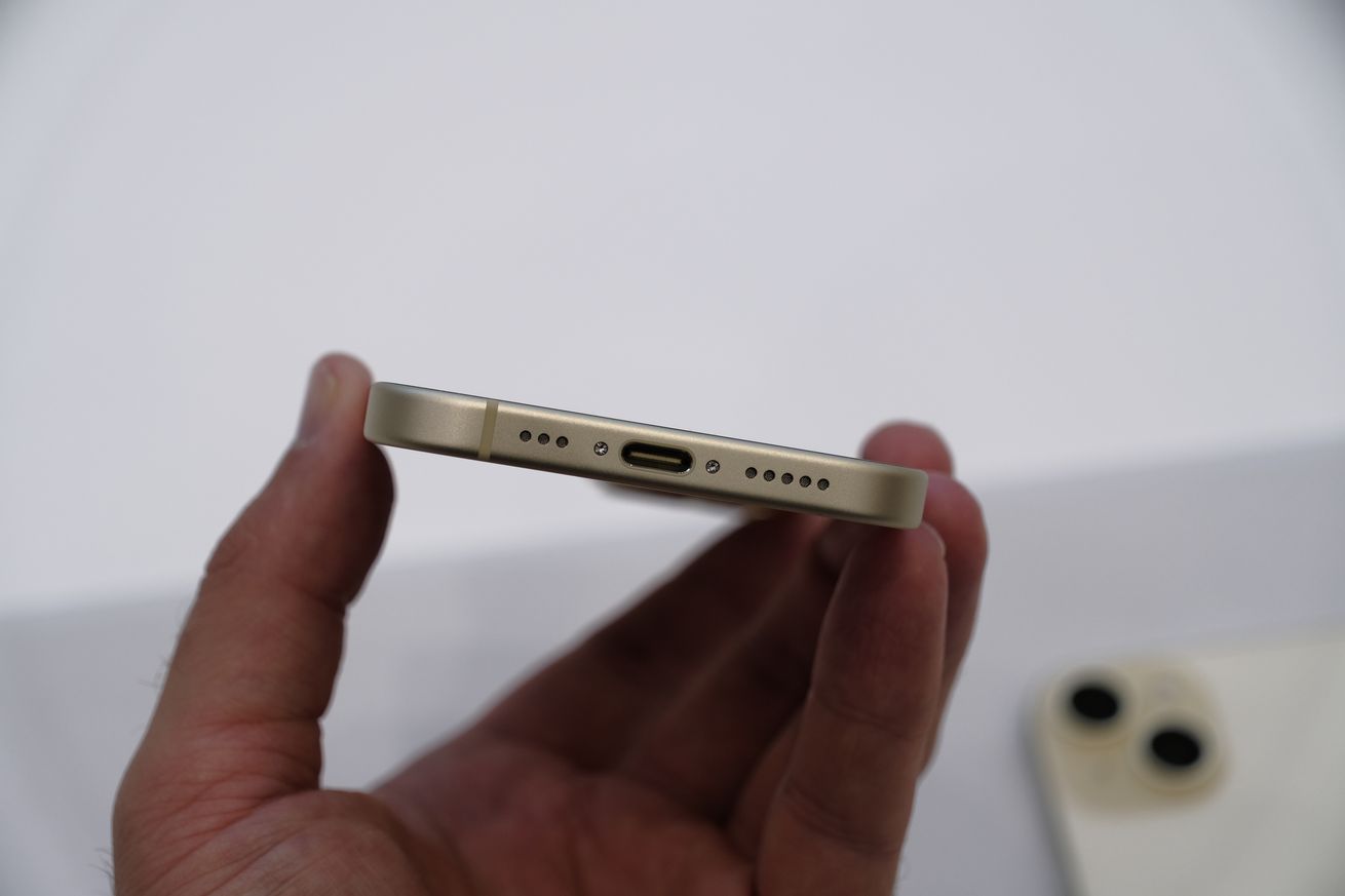
A picture of the USB-C port on the bottom of an iPhone 15
Photo by Dan Seifert / The Verge

Mark Gurman writes in the subscriber edition of his Power On newsletter for Bloomberg from this morning that he expects Apple to finish its transition to USB-C by 2025. Gurman says that, in addition to other products, he expects the company will release USB-C versions of the now-discontinued MagSafe Battery Pack and the MagSafe Duo “eventually. But don’t hold your breath.”

By comparison, Apple took either a little over a month or about two years to totally move over to Lightning, depending on how you look at it.

The company retired the 30-pin port from its most important products when it launched the fourth-gen iPad a little over a month after the iPhone 5’s September 2012 debut. But it also kept the iPod Classic in its stable until 2014, when it finally discontinued the famous MP3 player’s older form factor.

Gurman also writes that a new iMac, which could launch next month, will bring USB-C “Magic” accessories like a mouse and keyboard. Then he expects the company will release new non-Pro and Max AirPods with USB-C. That leaves few first-party products Apple sells that still use Lightning, like the first-generation Apple Pencil and the iPhone SE.

The Home Assistant Green is here to make the most powerful smart home platform more accessible

The Home Assistant Green is here to make the most powerful smart home platform more accessible
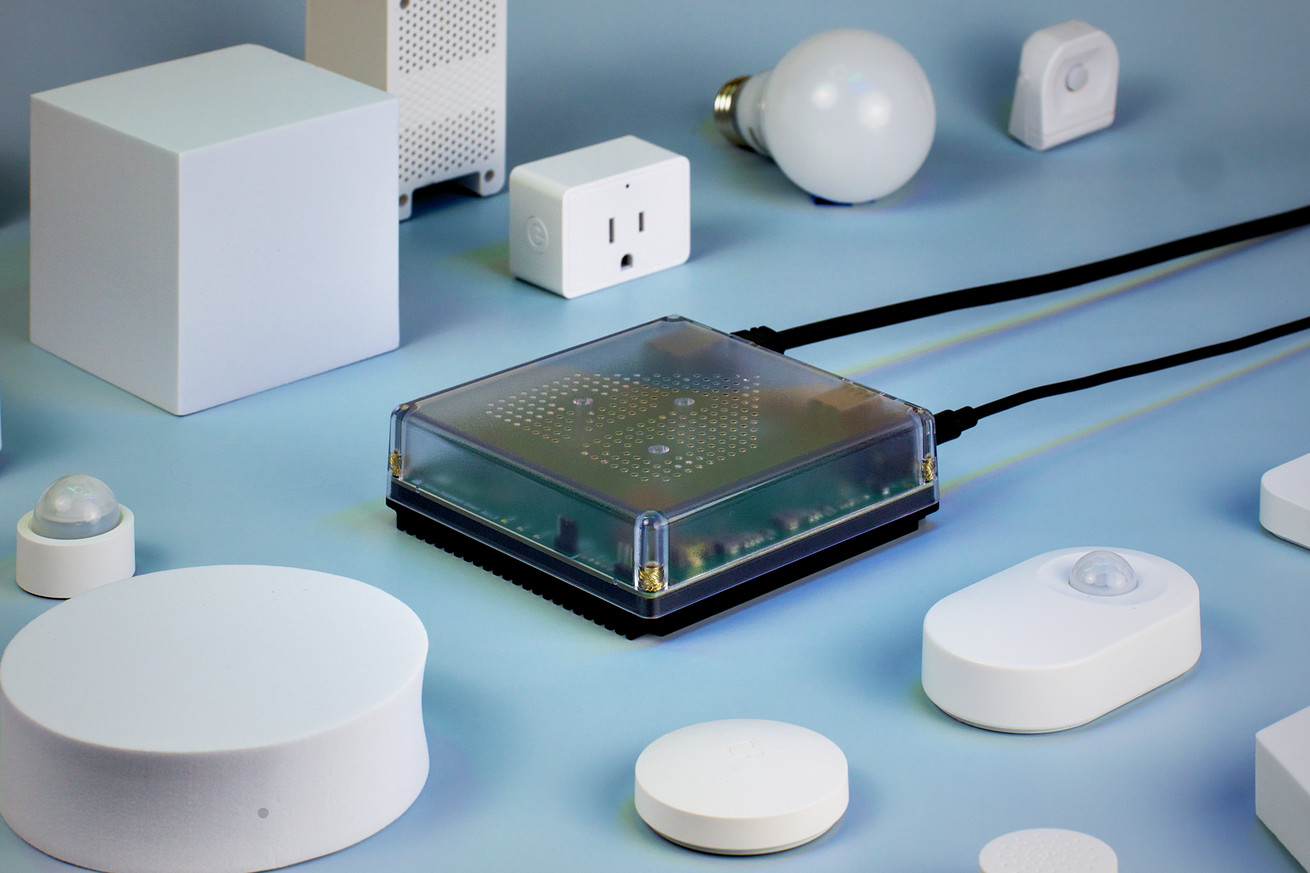
A Home Assistant Green box surrounded by smart plugs, lights, sensors, and other gadgets.
The Home Assistant Green can be the main command center for your smart home. | Image: Home Assistant

Buy enough tech and you can’t escape the siren call of a smart home. Amazon practically throws Echo Dots at you. Google will sneak a Nest Mini in the box with almost anything you buy in its store. Good luck buying a new kitchen appliance that doesn’t beg to be connected to the internet. All of those come with platforms that are locked down and cloud-dependent, requiring you to bend to their corporate wishes to use them.

But for the last decade, Home Assistant has been the go-to software for privacy-focused nerds who want all the benefits that Apple, Google, and Amazon products provide with infinitely better flexibility and fewer security risks. And now, for the software’s 10th birthday, the people behind Home Assistant are introducing a new product in the hopes of extending it beyond the domain of nerds: the Home Assistant Green.

“Our ideal future, long term, is that we want for people to get a privacy-focused smart home is not only something rich people or nerds have access to,” Home Assistant founder and CEO of Nabu Casa Paulus Schoutsen told me in an interview.

Like a lot of people, I originally ended up finding Home Assistant because I had too many devices that did not play well or at all with each other: Hue lights, smart speakers, a NAS, an air conditioner, not to mention with random switches, motion presence sensors, and other misfit dongles I bought on AliExpress. And while bigger companies are adopting Thread in an attempt to make everything play nice together, even interoperability on that has been a mess. A general dissatisfaction with the state of things and a need for painful specificity is apparently a common pathway to Home Assistant.

But there have been many roadblocks. While the process of getting Home Assistant set up is not tremendously difficult for the kind of person that screws around with Raspberry Pis regularly, it is still not an experience for the faint of heart. It is, at this point, still an enthusiast piece of software, and setting things up is still a very intentional process by design. But there’s a huge segment of people that want to jump in without messing around with hardware. The Home Assistant Green is a convenient little package and an attempt to make the onboarding part easier for everyone.

A box for everyone

A view of the back of the Home Assistant Green showing its ports. Image: Home Assistant
The Green box is similar in size to Raspberry Pi computers and just needs power and Ethernet to get connected.

Priced at $99 and planned as a permanent item alongside the Home Assistant Yellow, what makes the Home Assistant Green novel is not that it has powerful, high-end hardware, although the RK3566 quad-core CPU is fast enough to run the software without issue. What makes the device unique is the 32GB eMMC storage that’s preloaded with Home Assistant’s platform. It’s a more affordable and much easier entryway for people who want to dip their feet in the water without having to flash a memory card from another PC. The unit also comes with 4GB of LDDR4x RAM, a few USB 2.0 slots, an HDMI out, and a microSD slot for expansion.

The device is explicitly made to just run the Home Assistant Operating System — it’s not meant to be an all-purpose computer like a Raspberry Pi. It’s also not a piece of hardware you can just give to a tech-phobic relative yet but rather something for the person who is aware of Home Assistant but hasn’t wanted to deal with the hassle of getting it all running.

To get started, you just plug it in with the included power adapter, connect it to your router via ethernet (the Green does not have Wi-Fi “because the backbone of your smart home should use ethernet,” Schoutsen explains), and go through the setup process using your phone or another computer. The system will automatically detect devices on your network that can work with it. If you don’t have a Hue hub or existing way to connect to Zigbee devices (and experimentally Thread), you can add a Skyconnect dongle later. There are countless devices Home Assistant already works with, but for Home Assistant Green, simplicity is the point.

A shot of the Home Assistant Green in front of the Home Assistant Yellow and Home Assistant Blue. Image: Home Assistant
The Green joins the existing Home Assistant Yellow and Blue boxes.

I received an early sample of the device for testing, which came in a nice frosted plastic case with a metal base and simple-to-follow instructions. This is a much nicer-looking setup than what I currently have, which is a bare Raspberry Pi 4 Model B just kind of chilling out on my bookshelf with cables jutting out at various angles.

After plugging everything in and visiting the address of the Green in your computer’s browser (https://ift.tt/wEia9Kk) or the Home Assistant mobile app, you are greeted with a quick installation screen asking if you want to start a new smart home or restore an old one. Since I was already running Home Assistant, I made sure to do a full backup of my instance and downloaded it to my PC before unplugging it for my router. From there, I just uploaded the backup and waited for like 20 minutes while it put everything in place. It currently doesn’t let you know when it is done, so you just kinda have to refresh your browser window, but sure enough, all my stuff was exactly where I had left it, all my painstaking UI tweaks and integrations were there, and my Skyconnect functioned. It all just worked.

If simplicity is the goal, the team achieved it.

A screenshot of the Home Assistant set up screen. Image: Chris Person / The Verge
Once it’s plugged into your router, you set up the Home Assistant by visiting its IP address in your browser.

“Currently we’re aiming for the audience we call the ‘outgrower,’” Schoutsen explained via Discord. “It’s the one that uses Amazon / Apple etc., runs into the limitations and wants more. Searches the web and finds Home Assistant. At that point users already know they want a smart home and are looking for solutions to their problems, which Home Assistant generally can solve. We believe that with requiring a Raspberry Pi to get started or the relatively high price of the Yellow (you don’t know if your problems will get solved for $200), we were missing out on a good chunk of outgrowers. So with Green, we’re trying to offer a way for anyone to get started with Home Assistant.”

10 years of Home Assistant

Home Assistant, which celebrates its 10th birthday today, has grown a lot in the last 10 years. Like myself, Schoutsen got into the game after getting an expensive set of Philips Hue bulbs and hitting a wall with what they would let him do.

“I didn’t start Home Assistant because I wanted to write a smart home platform,” he explained. “Hue got released, and I bought it. I was at that point a visiting scholar at UCSD finishing my MSC thesis and was doing a bunch of Python stuff, so I wrote some code to talk to Hue.”

Since then, the project and the team have expanded to 28 people. Development of Home Assistant is funded by subscriptions to the company’s cloud service Home Assistant Cloud, as well as the sale of hardware like the Yellow, limited edition Blue, the SkyConnect dongle, and now the Green hub, allowing the company to develop without outside investors breathing down its neck. Outside of the core team itself, there are countless people adding blueprints and contributing to the code in their spare time. According to Schoutsen, Home Assistant is the second most active open-source project on GitHub.

 Image: Home Assistant
The newest Home Assistant logo, redesigned for its birthday.

When I inquired about possibly extending the project beyond the home, Schoutsen said he was not interested. “Anytime you expand the focus, you need to add features that fit one use case well, the other not so well,” he explained. “I wouldn’t want to go after hotels or offices. When talking to companies, people always thought we would go there, as that’s where the money is but not the fun . And we have no investors to steer us away from our focus on the home.” Building into offices would also require very strict access control, Schoutsen said, which would slow down the process by which they add features. This is a more sober vision for a product than you normally see coming from founders, one that was further compounded when I inquired about where they see the Home Assistant relative to Google or Apple’s offering.

“I don’t see us competing directly with Google / Amazon / Apple anytime soon for the segment of users that need to be taught about a smart home because the thing is that anyone with a smartphone has access to Google Home and Apple Home. We don’t claim that those users have a smart home, though. Even having multiple connected devices doesn’t make a smart home. A home only qualifies as ‘smart’ when people start caring about having their connected devices with unified control or work together.”

Having used both HomeKit and Home Assistant, I am inclined to agree. Home Assistant’s main market will always be people who want an intentional smart home, something that does exactly what they ask it to, not an overly curated closed garden. And while there is still tons of work to make it more inviting to newbies (finding user-created blueprints should be easier, Schoutsen admits), the core of what makes it work remains the same: thousands of users getting devices for their home, saying “this doesn’t work like I want it to,” finding a workaround, and sharing their progress.

“It takes quite some effort to keep the machine moving,” he said.

While I am, by my nature, a person who loves to tinker, I also live my life with the understanding that most people are not like that. You can invite curiosity with Raspberry Pis, but a lot of people want something that gets them most of the way there already. So much IoT hardware is sold on being seductively easy and inviting at the cost of being closed, insecure, and invasive. Looking at the semi-opaque plastic case of the Home Assistant Green, I hope that Schoutsen is right. I hope more people get into running Home Assistant, into open-source software, and ultimately about having total control over a truly “smart” home.

Apple continues to use our own mortality as marketing

Apple continues to use our own mortality as marketing
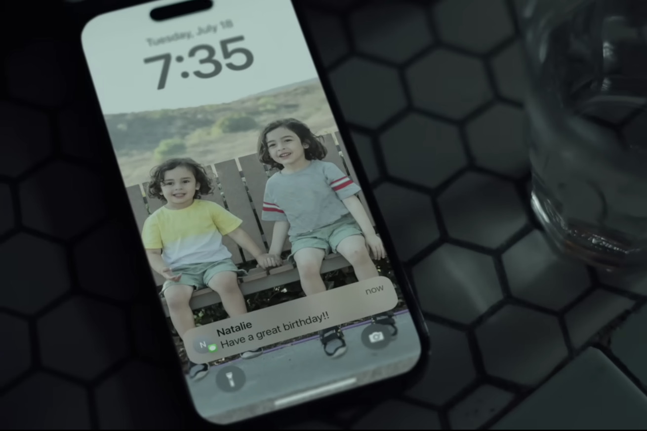
A screenshot showing an iPhone with a happy birthday message
Apple touted the watch and iPhone’s lifesaving feature in a new ad. | Screenshot by Emma Roth / The Verge

In recent years, Apple’s presentations have started to feature a new type of messaging: without an Apple Watch, you might be mauled by a bear, drown inside a sinking car, get stuck in a trash compactor, or even succumb to hypothermia after falling through an icy lake.

These disasters have always been averted by the presence of an Apple Watch. But this year, Apple’s messaging has started to change again: it’s not just the Apple Watch that can save you from possible death — but the iPhone, too.

At Apple’s iPhone 15 showcase, the company opened with an ad that weaved together the lifesaving potential of both the Apple Watch and the iPhone. The video depicted people celebrating their birthdays with friends and family, blowing out candles, and of course, getting “happy birthday” wishes on their iPhones.

As the ad introduced its main players, captions faded in at the bottom of the screen, such as one that said, “Apple Watch notified her of a low heart rate. Went to the hospital and received vital pacemaker surgery.” The next described a person using the iPhone’s Emergency SOS feature to get rescued while trapped in a blizzard, while another said a pregnant woman was rushed to the hospital for an emergency delivery after her Apple Watch detected a high heart rate.

These follow recent ads from Apple showing how an iPhone 14 might save you if your car rolls over or you’re stranded on top of a mountain.

The ads aren’t exactly wrong: there are dozens of real-life reports about people getting saved thanks to their iPhone or watch. After rolling out Emergency SOS to its Apple Watch in 2016, the company added fall detection, an electrocardiogram, and even a blood oxygen sensor. Last year, Apple touted a new Crash Detection feature for the Apple Watch and iPhone 14, which automatically alerts emergency services when it detects you’ve been in a car crash (or are just on some wild rollercoaster ride). And last year, Apple added a feature to iPhones that let users contact emergency services over satellite in case there’s no cellular connection.

These are undeniably great features, but there’s a reason Apple’s approach to advertising them has a tendency to make us uncomfortable: they sell us a product using concern for our own mortality — buy an Apple device or risk your life. They’re ads that play off fear rather than hope, and they stand in stark contrast to the ads that Apple used to release about its devices. A watch ad from two years ago shows people happily using their Apple Watch to improve their fitness; an early watch ad shows people using the device to connect with loved ones.

There might be a reason for this shifting approach. Features like fitness tracking and connectivity on your wrist no longer help the Apple Watch stand out among the competition.

Rivals like Samsung’s Galaxy Watch 6 and Google’s Pixel Watch have caught up to the Apple Watch in terms of health-tracking sensors, but they still haven’t added Crash Detection. The same goes for the iPhone. Apple might’ve only just added USB-C and periscope cameras, but Android phones still don’t have satellite connectivity (though it’s likely coming soon). Not only that but the addition of new safety features, including satellite connectivity, Roadside Assistance, and Crash Detection, helps differentiate Apple’s newer devices from its older ones, potentially giving users a good reason to upgrade.

On Tuesday, Apple revealed yet another reason why we might want to have our Apple devices with us at all times: Roadside Assistance. The service, which is compatible with the iPhone 14 and later, lets you contact AAA via satellite in case your car breaks down in the middle of nowhere. While Apple doesn’t pose some catastrophic scenario in which you might need to use Roadside Assistance, I wouldn’t be surprised if we see one depicted in an ad sometime soon.

These safety features have the potential to be moneymakers for Apple, too. Apple’s services sector raked in record revenue last quarter thanks to its over 1 billion paid subscribers to Apple Music, TV Plus, iCloud Plus, and its bundled Apple One service. Soon, this list of services will include Apple’s satellite connectivity and Roadside Assistance features, as the company’s satellite service is only available for free to iPhone 14 users for two years, and it’s offering the same promotion for Roadside Assistance on the iPhone 15.

We still don’t know how much Apple will make users pay after that trial period, which will come to an end for iPhone 14 users next year. But Apple seems confident that, once it has a customer, they won’t put these devices down. “They’re with us all the time,” Apple CEO Tim Cook said when talking about the watch and iPhone. “And if you left either one at home, I bet you’d go back and get it.” When your life depends on it, who wouldn’t?


Related:

How to reinvent your phone without buying a new one

How to reinvent your phone without buying a new one
Image: William Joel / The Verge

Hi, friends! Welcome to Installer No. 6, your guide to the best and Verge-iest stuff in the world. (If you’re new here, first of all, hi, hello, welcome, and second of all, you can read all the old editions at the Installer homepage.)

This week, I’ve been watching the wacky sci-fi series Command Z from Steven Soderbergh, updating all my browsers to fix a scary security issue, reading and listening to Cory Doctorow rage against Big Tech, cackling at this video about the state of the Hyperloop, trying the Endel app as work music instead of my all-day movie soundtracks playlist, and slowly cleaning up my camera roll with some help from Swipewipe.

Also this week, I have for you a bunch of new Apple gear (shocking, I know), two books worth reading, an app for keeping your family on schedule, some fun AI, and Graham MacAree’s seriously minimalist homescreen.

(As always, the best part of Installer is your ideas and tips. What do you want to know more about? What awesome tricks do you know that everyone else should? What app should everyone be using? Tell me everything: installer@theverge.com. And if you want to get every issue of Installer a day early in your email inbox you can subscribe here.)


The Drop

  • The iPhones 15. It’s been a few days since the Apple event, and I’m still not sure whether I’m excited about the iPhone 15 and 15 Pro. I like the titanium on the Pro, the camera, and that it’s lighter! And yay, USB-C! But that’s… kinda it. I think my 14 will do me just fine for another year, but if you do upgrade, know that I’ll be at least slightly jealous.
  • Apple’s USB-C EarPods. Now these, I am unequivocally into. I’ve spent years telling everyone to just buy a pair of EarPods and keep them in your bag — they’re $19, their sound quality is meh, but their mic quality is fantastic, and they’re super useful for phone calls / voice dictation / whenever your wireless headphones’ battery dies. The new ones will work with your phone, laptop, work computer, and basically everything else. I already bought two pairs.
  • A Million Miles Away. Amazon’s latest original movie is based on the story of José Hernández, a migrant farmworker who became a NASA flight engineer and went to the International Space Station. (He was also apparently the first person to tweet in Spanish from space, which is a very cool and very specific thing to track.) A feel-good movie for the weekend if that’s what you’re looking for.
  • The Six: The Untold Story of America’s First Women Astronauts. Speaking of great space stories, Bloomberg reporter (and Verge alum!) Loren Grush wrote a great book about the six women who helped expand and change the American space program and the huge amount of sexism and pushback they received in the process. Grush was also on our Decoder podcast this week, too — it’s a good listen.
  • Elon Musk. Big week for tech books, apparently! I confess I have not yet cracked Walter Isaacson’s 688-page tome, but I’ve been devouring excerpts and reviews, many of which say the same thing: Elon Musk is a deeply complicated person, definitely a smart person, maybe not a very good person, and it’s definitely worth asking hard questions about our present and future.
  • Spotify’s Daylist. The most interesting question in the music business right now is this: how do you differentiate yourself when everybody has all the same content? The thing Spotify does best is ultra-personalized playlists, and Daylist is an ever-changing, AI-curated one that supposedly matches your mood all day and night. So far, mine have been deeply weird — I woke up the other day to “mountain music indie folk thursday morning,” which, sure — but I really dig the idea.
  • Stable Audio. I’m currently deep down the rabbit hole of AI music-making tools (for a Vergecast episode coming Monday!), and Stable Audio is one of the more impressive tools I’ve seen. It comes from Stability AI, which also makes the image-generating Stable Diffusion, and works basically the same way: describe the music you want to hear, and a few seconds later, it appears. Nothing I’ve made so far is going to top charts anytime soon, but it’s an incredibly fun thing to play with.
  • Monster Hunter Now. This is definitely not a full-on Monster Hunter game for your phone. And The Verge’s Andrew Webster found it a little lacking in depth and strategy. But what it is — a real-world game like Pokemon Go in which you fight monsters and collect gear while you wait in line at the grocery store — is still pretty compelling.
  • Artifact Links. A very important genre of app to me is the Puttering App, the one I can just open and scroll through for a few minutes at a time in the hopes of finding something fun / interesting / useful. Twitter was kinda that, Instagram and Reddit are still kinda that, and Artifact wants to be exactly that. The news-reading app now lets you post any URL on the web, and already, I’m finding tons of good stuff following a few smart people.

Pro tips

It’s the time of year when suddenly I find myself hating my phone. There are new phones coming out, new versions of Android and iOS to be had, cool new features and apps and just so much new stuff to play with! But this year, rather than buy a new phone to satiate that urge, I’m going to try giving my phone a makeover.

For advice, I turned to Isaac Mosna, who you might know better as Canoopsy on YouTube and around the web. He makes great tech videos but also creates wallpapers, icons, and more cool phone stuff. I asked him to share a few tips on how to better customize your phone so that mine might look as cool as his does:

  • Start fresh. “Take everything off your homescreen, put it in the app library, and then start dragging things over. It’s a great way to start fresh without really starting fresh if you’ve had the same phone for a while.”
  • Have just one way to do things. “Try going with a very minimal setup. Don’t have your camera in the dock since you can use the Control Center. Android and iOS both can make your phone simpler, easier to use, and more enjoyable. No one likes to see 1,000 things when they turn their phone on.”
  • Keep it changing. “Find ways to cycle through different wallpapers, like by setting an album instead of a single picture. Whether it’s something that changes every hour or every time you turn your phone on, it’s a great way to have a new phone every time.”
  • Embrace space. “On Android, it’s really easy to leave empty spots on the screen. On iOS, you can use things like Clear Spaces to have blank spaces or put everything on one side of your phone where your hand naturally rests.”
  • Hide your widgets. “With Clear Spaces, you can also make widget stacks where you have the blank widget on your homescreen and then swipe to something else — it’s like a hidden drawer of widgets. It’s pretty fun.”
  • One homescreen. One. “I can’t think with multiple homescreens. Either put everything else in the app library or drawer or categorize things into folders on your homescreen.”

Screen share

Last week, when I asked Jennifer Pattison Tuohy to share her homescreen, it sparked a whole discussion in the Verge newsroom about how many apps we all had. Most people, not surprisingly, had a lot!

Graham MacAree, a senior storytelling engineer here at The Verge, did not have a lot. He had 22. And even that, he decided, was too many. So I figured, in a time of new phones and new software and general technological maximalism, I’d see what life was like alllllll the way on the other side.

Here’s Graham’s homescreen, plus some info on the apps he uses and why:

An iPhone homescreen showing just 16 apps Image: Graham MacAree / The Verge
Now that is a truly minimalist homescreen.

The Phone: An iPhone 13 Pro. This is the first phone I’ve owned that I actually enjoy using ... ish.

The Apps: Everyone’s on WhatsApp in England, so I only really need one chat app. Gmail, Messages, and Authenticator are all fairly standard. I’ve found Citymapper to be better than Maps at helping me navigate London’s various transit outages, and I reluctantly use Uber when said outages inconvenience me too much.

Monzo is a British bank, and it’s on my phone because it’s app-only. My Roomba helps keep my house “free” of dog hair, and then Pokémon Home lets me continue my extremely low-key quest for a living Pokédex. MLB is for when the Seattle Mariners are playing while I’m out and about (live sports are basically the only things I’ll watch on a phone screen). Spotify gets used a lot, as does Chrome. Having quit Twitter and Facebook, I don’t have any social media apps at the moment, but I’m sometimes briefly tempted by Bluesky.

In general, I’m exactly the right age to have learned to do everything on my computer instead of my phone, and I’ve never updated my habits in light of the fact that I live in the 21st century. If I use something more than once a month or so, it lives on the homescreen.

The Wallpaper: Normally, this would be a photograph of my children, but I’d rather they not be online. I temporarily switched my wallpaper to a cool picture of Sharpless 132, which is about 10,000 light-years away. It’s basically an enormous gas cloud, which hides some incredibly massive/bright stars. Also, my dad took the photograph, so that’s neat, too.

As always, I also asked Graham to share a few things he’s into right now. Here’s what he shared:

  • Dancing! I have begun choreography for an Argentine Tango recital in November, so that’ll occupy quite a lot of my life over the near future. I’ve been dancing seriously for almost three years now and do performances about twice a year. It’s nerve-wracking but fun.
  • Painting videos. I’m playing around with the idea of getting back into Warhammer 40,000 because painting tiny people / monsters / tanks seems potentially relaxing. Right now, that idea manifests itself as watching other people paint tiny people / monsters / tanks, which is definitely relaxing. Will I ever progress to doing this myself? Who can say.

Crowdsourced

Here’s what the Installer community is into this week. I want to know what you’re into right now as well! Email installer@theverge.com with your recommendations for anything and everything, and we’ll feature some of our favorites here every week.

“A lot of my life, online and offline, is captured on Futureland — a journal / routine organizer / tracker hybrid that can be a little hard to explain but feels wonderfully organic in practice. One of the few quiet, satisfying places on the internet, and the only app on my phone that consistently gets me looking up from the screen and moving toward what I want to be doing.” — Min-Taec

“Currently addicted to playing Finity on Apple Arcade.” — Scott

“Calculator apps are boring and haven’t seen any innovation, until Numbr! It’s a notepad mixed with a calculator, and I’ve used it exclusively as my calculator for several years. It’s primarily a web app, but there’s also a handy Chrome extension, and all the syntax is explained on their Github.” — Ross

“I have been OBSESSED with Usagi Shima, a little bunny-collecting chill island game with vibes reminiscent of Neko Atsume and a bit of Animal Crossing relaxation.” — Evelyn

“Subscribed to Tessie. Allows my Apple Watch to be used as a Tesla key similar to my phone. Not sure how to feel about it, but it’s been super convenient!” — Chris

“My wife found the app FamilyWall — it is our common app for recipes, meal planning, contacts, budgets, and bucket lists. What I like is that the app connects things: when I enter a recipe, I can plan the meal for a specific day and add the ingredients to the grocery list. I can also connect the calendar with other Outlook calendars so I have private and work calendars in sight. Additionally, we can share notes and pictures and make individual timetables.” — Chris

One Sec. This app primarily allows you to set up a delay (referred to as an intervention) when opening specified apps. As an example, I have a 20-second breathing exercise intervention setup when opening up social media apps on my phone, and it won’t let me access the app until that exercise is complete. I have found it very useful in getting my attention when I mindlessly open up social apps during the day or during small waiting periods like waiting for a coffee. It’s a subscription app for iOS and Android (Android is a beta), but it’s pretty cheap, and they have a one-time license if you don’t want the constant subscription.” – Andrew

“The new Camera app from Blackmagic, plus their cloud integration so that multiple cameras can all upload to Davinci at the same time.” — Iestyn

“Instead of relying on Rotten Tomatoes for questionable movie ratings, use Letterboxd. As a bonus, some of the reviews for the really bad movies are super fun. The Flash, with 2.7 stars out of 5: ‘the cgi in this movie makes superman’s mustache removal look like a work of art.’ Honesty and humor. Chefs kiss. ” — Brandon

Flight Radar 24 is wonderful. Want to know where that jet overhead is headed? Pop open the app and turn on AR for a live overlay. I also have all emergency alerts as silent notifications. Occasionally, you get military jets or big flight diversions. This week, I found out the SIN-JFK longest flight in the world goes over my parent’s house.” — Sean

“I’m actively listening and changing my ringtone and notification sounds with the ones introduced by iOS 17. They’re so good!” — Gabriel


Signing off

I am obsessed with scooters. Scooters you buy, scooters you rent, scooters you pay for by the minute and then throw into the river when you’re done — I love them all. And I can’t remember the last time I fell for a scooter like the new Honda Motocompacto. It is utterly impractical in every way — only 12 miles of range, weighs over 40 pounds, looks like a giant floppy disk on two wheels, costs $995 — but I want to toodle around my neighborhood on this thing in a way you would not believe. More weird scooter design, please!

See you next week!

samedi 16 septembre 2023

Everything you need to know about switching to USB-C

Everything you need to know about switching to USB-C
iphone 15 pro usb c port
Photo by Nilay Patel / The Verge

Are you an iPhone user looking to upgrade to... the iPhone? Well, you’ll have more to consider this time around since the new iPhone 15 comes with a USB-C port, ending an 11-year run for the company’s proprietary Lightning charging plug.

USB Type-C (or just USB-C) is the universal charging and data-transferring connector, and it’s now on pretty much every modern gadget, including Apple’s iPads and MacBooks. It might just be the last cable we’ll ever need.

Do I need to buy new chargers?

Apple has made us buy new cables before, but this time, you probably already have the things you need to charge your new iPhone. Apple stopped including charging bricks with the iPhone 12 in 2020, but the 15 and 15 Pro do at least come with a short C-to-C cable in the box.

To get the fastest charging speeds on an iPhone 15, you’ll want at least a 20W USB-C charger. If you’ve bought a MacBook since 2015 or an iPad Pro since 2018, their bundled USB-C chargers work splendidly, though they’re bulkier than you really need. You can pick up a tiny 20W GaN charger for under $15. Lots of Verge staffers like this Anker one.

Just about any USB charger will work in a pinch. If the charger has a USB-A port, you’ll need a USB-A-to-C cable to connect to your phone and probably a magnifying glass to try to read its power output settings. USB-A chargers can top out at about 18W, which is close enough, but those are relatively rare. Chargers for lower-powered devices like headphones or older phone chargers — like the little white cubes Apple used to bundle with the iPhone 11 and below — are more likely to be 5W or 10W at best, and they’ll take a long time to charge your phone. Spend the $15 on a good USB-C charger.

As an iPhone user, you may already have multiple charging setups with Lightning cables in each room. In that case, it’s just a matter of replacing the cables. If you don’t already have a bunch of USB-C cables lying around — or you do, but you don’t know what kind of USB-C cables they are — it’s time to get some. But before you jump on Amazon and toss the first discount cable that’s winning on the site’s search results into your cart, you should know that USB-C cables aren’t something you necessarily want to buy cheap.

 Photo by Umar Shakir / The Verge
I have found this Apple 5W USB charger in drawer A and a Samsung Galaxy pack-in USB-A-to-USB-C cable in drawer B.

As an iPhone user, you might already have Lightning cables set up in each room and would need just to replace the cable while keeping the power adapter where it is. But if you only have the wall warts and somehow have no USB-C cables to use with them (except for the one that will come in the iPhone 15 box), then it's time to go shopping.

But before you jump on Amazon and toss the first discount cable that’s winning on the site’s search results into your cart, you should know that USB-C cables aren’t something you necessarily want to buy too cheap.

Okay, what kind of USB-C cables should I buy?

USB-C is a mess. Some cables can fast-charge a MacBook Pro but transfer data at a glacial pace. Others can do fast data transfer but are too short and inflexible to really use for daily charging. Despite some efforts at labeling, it’s nearly impossible to tell at a glance which cables do what.

Anyone can slap a USB-C plug on a cable and sell it online. From time to time, this causes problems. It’s rare nowadays to find a cable that will fry your device, but there’s no reason not to look for USB-IF compliance. The USB Implementers Forum (or USB-IF) invites USB-C cable manufacturers to put their power noodles through compliance testing. Those who do the testing earn themselves a cool logo for their packaging that also lets customers know what kind of charging power and data transfer speeds to expect. When shopping for a cable, try and see if the manufacturer uses a logo or at least states that the cable is certified by USB-IF (and if true, their cable should show up on the USB product search site).

As far as the specific types of cables to look for, here’s the incredibly short version: for charging, you should get a USB-C-to-C cable, USB 2.0, six or 10 feet long, ideally USB-IF-certified. There’s no real reason to get something rated for more than 60W charging, but there’s not much price difference between cables rated for 60W, 100W, or 240W, and a higher-rated cable will work just fine for a phone. Don’t bother with data transfer speed for this cable; you’re not transferring data with it.

Yes, the cable that comes in the box is just fine for charging. It’s just short. A six- or 10-foot cable is much nicer to charge with. A 6.6-foot USB-IF 100W charging cable is under $15.

If you’re planning on copying data from your new iPhone 15 Pro or Pro Max, specifically to get your video footage onto a computer quicker than AirDrop, you’ll need a cable that can transfer data at high speed. The iPhone 15 Pro models support USB 3 at up to 10Gbps, so you’ll need a cable that’s rated for at least 10Gbps. In the newest, simplified USB-IF branding, that’s USB 10Gbps. Older cables might say USB 3.1 Gen 2 or USB 3.2 Gen 1x2 or USB 3.2 Gen 2. A three-foot USB-IF-certified 10Gbps and 100W cable is also under $15.

A table showing the revised branding for USB. Image: USB-IF
The USB-IF’s “simplified” branding, released in 2022. For data transfer with the iPhone 15 Pro, look for at least USB 10Gbps.

Unless you’re an ultra-minimalist or you’re buying a cable for your travel kit, get separate cables for your daily charging and data transfer, preferably in different colors.

Speaking of travel: you might be tempted to look for a power-only charging cable, but that’s outside the USB-C spec; any power-only cable is improperly wired by definition and not worth the risk. Better to carry your own charger and never plug your phone into someone else’s USB port.

What about those MagSafe chargers?

You could totally sidestep USB-C and just charge your iPhone 15 wirelessly instead.

Apple kicked off a whole new accessory ecosystem with MagSafe when it launched the iPhone 12. It uses magnets to align a Qi-based charging coil on the back, which opens up fun new charging options like floating iPhone docks. Apple even added a cool StandBy software feature in iOS 17 that turns the iPhone’s screen into a fancy clock with widgets when placed on a MagSafe dock.

 Photo by Antonio G. Di Benedetto / The Verge
There’s a whole lot of MagSafe charging options out there.

If you buy Apple’s MagSafe charging puck, you’ll still need to have a USB-C power adapter capable of at least 20W of charging to make it work. Certified MagSafe options will, at best, charge iPhones at 15W. And non-Apple-blessed “MagSafe-compatible” options will only provide 7.5W of power to iPhones. However, Apple announced iPhone 15 will support the magnet-based Qi2 charging standard, which means it’ll likely open the phone up to faster and cheaper options that probably won’t destroy your iPhone like a bad USB-C cable could.

Sounds nice. Should I MagSafe all the things?

Wireless charging has its conveniences, but USB-C is still better most of the time.

MagSafe chargers that are placed neatly in thoughtful places in your home, like on your work desk or side table, are a great supplement to charging and using your iPhone — especially when hands-free. However, wired charging with USB-C is faster and is less likely to heat up your iPhone compared to the inefficiencies of wireless charging in general.

What else should I know?

It’s prime time for a mass of Lightning to USB-C dongles to flood the market, but don’t buy them. Those adapters are less convenient for plugging in, and non-MFi-certified ones could damage your iPhone 15 or the Lightning cable you’re using. Just buy a USB-C cable — unless you have a special Lightning accessory, like a microphone or other adapter, you can’t live without, in which case you can buy Apple’s kinda pricey $29 Lightning to USB-C dongle.

That said, if your special Lightning accessories aren’t mission-critical to you, USB-C has been around for a decade, which means that a whole world of dongles, adapters, hubs, and docks just opened up in front of you, including stuff you may already have if you’ve been living the dongle life for a while.

Apple sells its own USB-C cables, too, but you’re going to pay a high price of $69 for the data-capable one. That’s because it's designed to operate USB4 / Thunderbolt 4 equipment, docks, multiple 4K displays, high-speed data transfers, and more simultaneously while also delivering 100W of charging. It’s overkill for the iPhone 15 and isn’t very flexible, so you should skip it. But if you do want the extra abilities Apple’s option offers, there are cheaper options like this Cable Matters one.

For Apple CarPlay users: unless your vehicle already supports wireless CarPlay, you’re going to need a USB-C cable, either USB-C-to-C or A-to-C, depending on the age of your car. Otherwise, MagSafe mounts could make operating your iPhone in your car cleaner and safer.

Changing to the universal standard is good, right?

USB-C can feel a bit more fragile than Lightning since the plug has more complexity (and has space to get lint stuck in both the port and the plug). However, the new connector is a huge upgrade otherwise. Lightning can’t transfer data at high speeds and, most importantly, doesn’t work with other devices.

With Lightning on its way out, there could be a sudden influx of e-waste as Apple users swap out their devices for the new iPhone 15. It was one of Apple’s biggest arguments while hesitating on the European Union’s mandate that all smartphones must switch to USB-C.

If you don’t need your Lighting cable anymore, look to see if you can either sell or donate them to someone who could. Otherwise, Apple, Best Buy, and others will take them for free recycling.

Switching to USB-C won’t be a walk in the park, and you’re going to encounter choice fatigue when it comes to selecting new cables, power adapters, and accessories. But the most important thing to remember is that USB-C is here to stay. And as long as Apple is on board with universal standards, you may never have to do this again.

Lightning was great, actually

Lightning was great, actually
Two Lightning connectors.
Photo by Amelia Holowaty Krales / The Verge

The world is rightfully celebrating the iPhone’s switch from Lightning to USB-C this week. People love to hate on Lightning — and they have good reasons to. Many of the world’s most popular devices now use USB-C ports, including Apple’s own iPads, meaning iPhone owners have been stuck toting around an extra cable just for their phone and its accessories.

But if you’ve been living in the Lightning world for the past decade like I have, things have been great anyway. I’m not ashamed to say it: I’m sad that Lightning is finally going away.

The Lightning Life, at least if you have an iPhone, has been convenient. Using a Lightning cable hardly requires any thought — its biggest revelation, at first, was that it could charge your phone no matter which way you plugged it in, a huge improvement over Apple’s old 30-pin connector. Plugging it into my iPhone when I’m sleepy before bed never feels like a hassle.

The connector’s small size has kept everything Lightning-related small and portable, too. Back in 2012, when Apple debuted the Lightning port on the iPhone 5, this compact size was a huge part of what made the announcement so exciting. Lightning was 80 percent smaller than the comparatively huge 30-pin connector the iPhone had used before. That meant that Apple’s products — and the cables themselves — could look that much nicer. I can’t prove this, but I have to imagine that the iPhone 5’s sleek look was due in part to the switch to the smaller Lightning connector, and those tiny changes add up to saved space in a bag or pocket.

Not only are the cords themselves easy to travel with but the Lightning standard also created a generation of reliable and portable travel accessories. It powers one of my favorite Apple devices ever: the MagSafe Duo. In spite of Dieter Bohn’s middling impressions, I picked one up on sale and, frankly, I adore it. It’s a low-profile way for me to charge my iPhone, Apple Watch, and AirPods whenever I’m at my desk. When I travel, I can just fold up the MagSafe Duo and slip it into a small pocket in my backpack so that I can easily charge my devices at my final destination.

And even at home, the Lightning Life has been reliable. I never worry that Apple’s Lightning cables will randomly stop charging my devices (though I’ve been lucky to avoid some of the durability issues Lightning cables are sometimes known for). Apple’s solid magnets and the MagSafe Duo mean that my iPhone and Apple Watch almost always start charging as soon as I drop them on their charging spots — there’s no fussing around to make sure they’re aligned correctly.

Picture of Magsafe Duo charger with phone and Apple watch on it. Photo by Dieter Bohn / The Verge
The MagSafe Duo — powered by Lightning.

With Lightning, I’ve built up an extremely trustworthy system for charging many of my Apple devices that I’m very happy with. Yes, Apple designed it that way thanks to its MFi program that gives Apple a cut of every MFi-certified charger or cable sold. And yes, because device makers have to go through Apple for MFi certification, that probably meant that some interesting charging accessories didn’t get made. But the MFi system meant that accessories worked and lacked the confusion of USB-C. Saying goodbye to Lightning doesn’t just mean losing a port and a connector; it means saying goodbye to a great collection of cables and products that I’ve come to depend on as part of my daily life and travel routines.

With all that said: I do understand where the Lightning haters are coming from. These days, basically every other device I own charges over USB-C. The iPhone has been the lone holdout, meaning that I have to toss both a USB-C power brick and my iPhone charging gear (including the MagSafe Duo!) in my bag before heading out the door.

USB-C offers the tantalizing promise of an extremely dependable system for charging all of my gadgets. And it will be a worthwhile switch once I have to make it — I’m in no rush to upgrade from my beloved iPhone 12 Mini — though there will be some friction. I’m already grumbling over the fact that Apple unceremoniously dumped the MagSafe Duo instead of releasing one with a USB-C port (though there are USB-C-based alternatives I can consider).

But those are minor quibbles. USB-C ports on the iPhone 15 lineup are obviously the better choice in 2023. USB-C does everything Lightning can do, and it often does those things better. Whatever my gripes about buying new charging gear, the transition won’t be nearly as painful as the switch from the 30-pin connector to Lightning; I already have a bunch of USB-C charging cables and bricks that I can use with a USB-C-equipped iPhone.

Still, I’ll look back on my 11 years (and counting) of Lightning Life fondly. They have been years of easy charging and lighter backpacks.

When Apple executive Phil Schiller introduced Lightning in 2012, he called it a “modern connector for the next decade.” He was more than right.

Battle Over Electric Vehicles Is Central to Auto Strike

Battle Over Electric Vehicles Is Central to Auto Strike Carmakers are anxious to keep costs down as they ramp up electric vehicle manufacturing, while striking workers want to preserve jobs as the industry shifts to batteries.

vendredi 15 septembre 2023

Meta’s next smart glasses may have just shown up in FCC filings

Meta’s next smart glasses may have just shown up in FCC filings
Photo by Amanda Lopez for The Verge

Meta’s next pair of smart glasses made in partnership with Ray-Ban owner Luxottica might be released sometime soon. As spotted by Lowpass’ Janko Roettgers, a listing for a pair of smart glasses by Luxottica Group has surfaced in the FCC’s database. Given that the original Ray-Ban Stories are listed under Luxottica and recent reports on a second-generation pair of the smart glasses, I’m inclined to believe that these filings are for the new specs.

The original Ray-Ban Stories let you capture photos and videos using the cameras next to the lenses and look through what you capture on a companion app. They also have microphones and speakers to capture and play audio. They haven’t been a hit; The Wall Street Journal reported in August that less than 10 percent of the people that bought the smart glasses use them on a monthly basis.

Despite the low usage, it seems Meta is soldiering forward with generation two. The new smart glasses will let you live stream video to Facebook and Instagram and even hear comments from the people watching your stream, Roettgers said in August: “Live streamers will be able to directly communicate with their audience, with the glasses relaying comments via audio over the built-in headphones.” The Wall Street Journal reported that the new smart glasses will have “improved battery life and better cameras” and are scheduled to be released in the fall or spring 2024.

Meta didn’t immediately reply to a request for comment. The company is hosting its Connect conference on September 27th and 28th, so perhaps we’ll hear more about these new smart glasses at the show. At that event, we already know that Meta plans to share more about the Meta Quest 3, which is scheduled to come out this fall. That device recently crossed the FCC, too, so I’m guessing Meta is going to meet that deadline.

X will now tell you if someone deletes a post you annotated with a Community Note

X will now tell you if someone deletes a post you annotated with a Community Note
The X logo on a colorful blue and light purple background.
Illustration: The Verge

If you add a Community Post to a post on X (formerly Twitter), X will tell you if the person who wrote the post deletes it, the company said on Friday.

“Contributors consistently say their goal is to keep others well-informed,” X wrote on the Community Notes account. “This can happen when a helpful note appears on a post, and also when an erroneous post gets deleted. Starting today, writers will be notified when a post on which they wrote a note gets deleted.”

The idea here seems to be to give people with the ability to add Community Notes another tool to keep other users accountable. On one hand, I think this could be really useful; writing about deleted posts is a key aspect of my job. But on the other, given the generally-bad vibes on X, I worry this tool may be abused to shame people who delete their posts over minor errors or factual inaccuracies.

This new Community Notes feature is the second that X has added this week. On Tuesday, X announced that people rating a note will see more note proposals so they can “consider other notes before submitting their rating.” X owner Elon Musk is a big advocate for Community Notes, and the feature has gotten some notable updates, including expansions to images and videos, since he took over the company.

Do Coding Boot Camps Make Sense in an A.I. World?

Do Coding Boot Camps Make Sense in an A.I. World? Coding boot camps once looked like the golden ticket to an economically secure future. But...